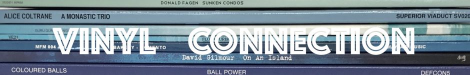
It all started with an idea that it would be fun to display some album cover art on the walls at Vinyl Connection Headquarters. Having a couple of suitable frames lolling about in the music room, it was simply a matter of negotiating with Ms Connection over where they should hang.
Either side of the ugly old wall furnace on the even uglier fake-wood panelled wall section was agreed upon as a place both visible and hidden, so with this apparent contradiction sorted, pairs of LP covers were duly chosen for the private enjoyment of the locals.
When the blog began in May 2013, the intention was to post weekly. But it seemed that more was needed to build an active connection, so I hit upon the idea of sharing my love of album cover art via—you guessed it—pairs of themed record sleeves. It was fun, and I enjoyed indulging my love of the endlessly varied sleeve artwork. For extra musical harmony, each post was titled with a song.

But almost four years on, there is a massive back catalogue of Vinyl Connection posts, so I’ve decided to do a clean up. I’ll pick some of my favourite ‘Cover Pairs’ and repost them in job lots as I delete the original posts (which only featured one pair per outing). Maybe some cover-art fans who missed these the first time around will find something to enjoy.
*
COVER ART PAIR #1
(PUT ON YOUR) HIGH-HEELED SNEAKERS

VARIOUS ARTISTS “Bumpers” [Island, 1970]
The Pointer Sisters “Steppin” [ABC Blue Thumb, 1975]
The photo does not show this at all well, but the Pointer Sisters high-heeled sneakers have the straps actually cut out of the cover. Neat.
I recall pondering whether to have the ‘feet’ facing towards or away from each other.
*
#3
YOU LIGHT UP MY LIFE

Triumvirate “Spartacus” [EMI Electola, 1975]
Bee Gees “Idea” [Polydor, 1968]
A light bulb moment for sure.
*
#6
SPOT THE PIGEON

Chilliwack “Breakdown in Paradise” [Mushroom, 1979]
Graham Parker “(The Real Macaw)” [Arista, 1983]
This remains one of my favourites; I find this double avian image very funny. But then, it has been suggested on a number of occasions that I’m a bit strange. Perhaps even a bird brain.
*
#4
THINGS CAN ONLY GET BETTER
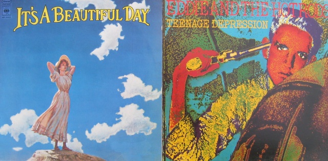
It’s A Beautiful Day “It’s A Beautiful Day” [CBS, 1969]
Eddie & The Hotrods “Teenage Depression” [Island, 1976]
An attempt as a dramatic composition. Sixties hope versus Seventies despair?
*
Would enjoy hearing responses, if only to establish whether I’m the only person on the planet who finds these juxtapositions entertaining.
*

Yes, these juxtapositions are entertaining – and probably the tip of the iceberg.Feet facing inwards with the High Heeled Sneakers would draw one’s eyes to the beautifully ugly wall furnace (a wall furnaces that looks rather familiar!). Feet facing outwards wold take one’s eyes towards the wonderful fake wood panelling.Must admit I’d never heard of Chilliwack. Cheers.
LikeLiked by 1 person
Cheers Vin. It probably could go on forever, but probably won’t! Thanks for dropping by.
LikeLike
It’s a Beautiful Day…something tells me that Deep Purple borrowed something of theirs. Must dig through memory.
LikeLiked by 1 person
Love this, Bruce. I’m sure you have plenty of others to share so how were you able to pare down your list of pairs? I own three of these albums and should probably hear at least two others.
LikeLiked by 1 person
Glad you enjoyed it Rich. In fact, later album cover series included many more examples of the ‘theme of the day’, thus proving your point that a pair was never enough!
LikeLike
I can assure you Bruce, although we live at near geographical antipodes, we could not be more on the same page when it comes to enjoying such juxtapositions!
LikeLiked by 1 person
I see what you did there. Opposites and juxtapositions – right on, bro!
LikeLiked by 1 person
I join the other commenters in stating that you are far from the “only person on the planet who finds these juxtapositions entertaining.” Love that vibrant avian color, you birdbrain, you!
LikeLiked by 1 person
Birdie Num Nums!
LikeLike
[…] via COVER PAIRS REDUX — VINYL CONNECTION […]
LikeLike
Disappointing lack of nudity involved. Null point from me I’m afraid. Especially when you own a Flash LP.
And what is that strange slotted contraption between the pictures?
LikeLiked by 1 person
See keepsmealive comment.
LikeLiked by 1 person
These are great. The pair that stood out being the ‘double avian’. Also good to see the Bee Gees in there…
LikeLiked by 1 person
There is, perhaps, a whole post on covers with light globes. What a bright idea!
LikeLiked by 1 person
I definitely enjoy this idea! MORE!
Also, I agree with 1537: needs more bewbs. 😉
LikeLiked by 1 person
You lads wouldn’t be winding me up, by any chance?
LikeLiked by 1 person
Nope. BEWBS. Trust us.
LikeLike
Have always liked your themed covers posts, whether in pairs or longforms. Hope you’ll move them all to “collected” re-posts vice actually deleting parts of your history permanently.
On this one, I especially like the way the two Chilliwack birdies are glancing back nervously to see what the giant blue dude is up to.
LikeLiked by 1 person
Thanks Vic. I still enjoy a number of the pairs though few make me smile like the birds one.
And yes, the plan is to compile them. Where there is something interesting in the responses (e.g.: #3) I’ll leave the original too.
LikeLike
[…] Cover Pairs Redux […]
LikeLike