
A SENSE OF PLACE

1. Ayers Rock — Big Red Rock
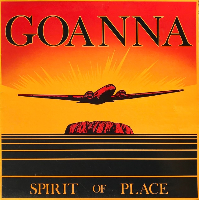
2. Goanna — Spirit of Place

3. Yothu Yindi — Tribal Voice

4. Andrew Richardson — Expanse
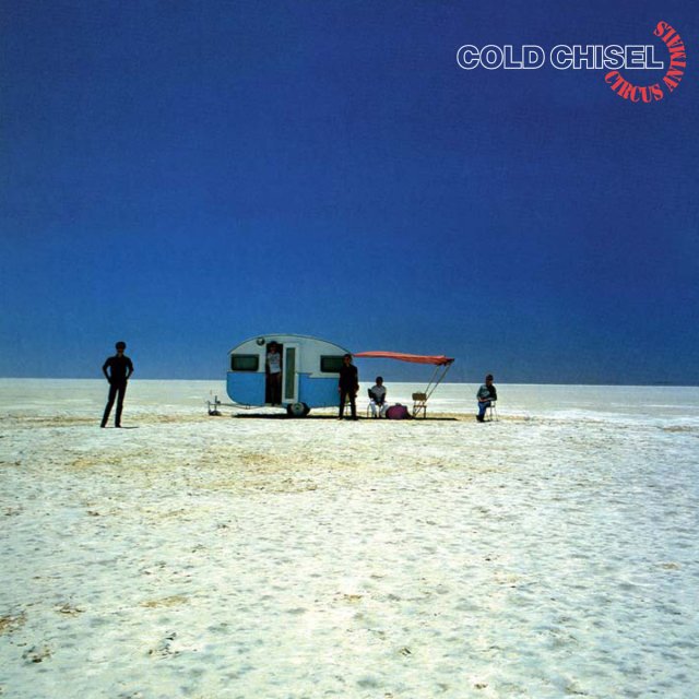
5. Cold Chisel — Circus Animals
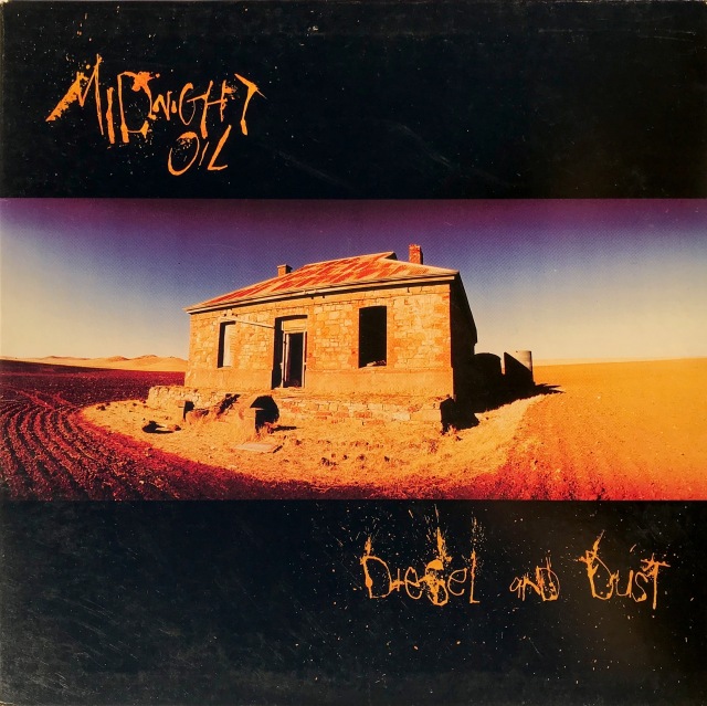
6. Midnight Oil — Diesel and Dust

7. Australian Crawl – The Boys Light Up
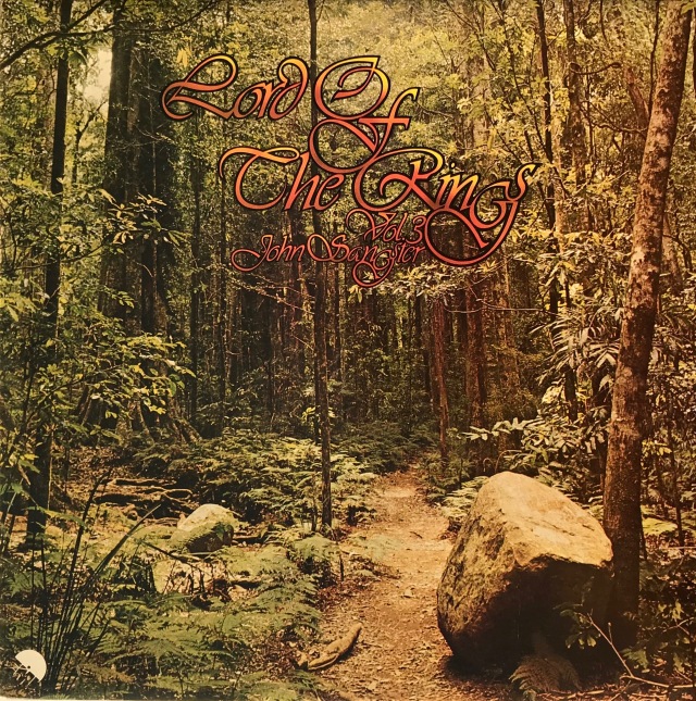
8. John Sangster — Lord of the Rings, Vol. 3
Although most Australians live in urban areas—indeed, they cluster in the cities of the east and south-east coast—our sense of identity is inextricably linked to the vast interior of the country. It’s odd. Most Aussies have never been anywhere near the red heart of the continent. Yet its ancient deserts and salt-bed lakes offer iconic images that artists of all persuasions are drawn to. Perhaps it’s the light.
Hope you enjoy this set of covers. All the albums bar one come from the so-called ‘first vinyl era’.
The second part is called ‘Smoke and Mirrors‘.
[The feature image is the inner sleeve of Ayers Rock Big Red Rock. The cover has a die-cut hole the shape of Uluru (the First Nation name) with the inner sleeve image providing the colour and texture. I love die-cut covers.]
Big Red Rock — 1974
Spirit of Place — 1982
Tribal Voice — 1991
Expanse — 1984
Circus Animals — 1982
Diesel and Dust — 1987
The Boys Light Up — 1980
Lord of the Rings Volume 3 — 1977

Lovely all!
LikeLiked by 1 person
Thanks Mike. Only one I had to venture into net-world to get!
LikeLiked by 1 person
Ayer’s Rock is by far my favourite image. Never imagined it on an album cover like that before. Deep Purple used it, not nearly as effectively.
LikeLiked by 1 person
“Deep Purple In (Ayers) Rock” presumably!
(It’s indigenous name is Uluru, but I couldn’t resist a little purple joke)
LikeLiked by 1 person
I knew that because I enjoy reading geology in my spare time!
GREAT joke honestly 🙂
But the album was just called Australia ’99. Wasted opportunity!
LikeLiked by 1 person
Cold Chisel played here in Thunder Bay back in the summer of 81 opening for Ted Nugent…
Nice selection of covers..cool idea
LikeLiked by 1 person
Goodness me. Chisel got around, didn’t they? Were you there deKe?
And while we’re asking questions, is Thunder Bay at the end of Thunder Road?
LikeLiked by 1 person
Yup I was at that show…
Not to sure if Thunder Bay is at the end of Thunder Road but it is kinda in the middle of no mans land in Canada …
If that helps any…haha
LikeLiked by 1 person
Wow, love ’em! That Oils album brings me right back.
LikeLike
Great! That Oils album did best overseas, I think. And d’you know, Sarca, I bought the copy in the photo in a shop in Portland OR, in either ’93 or ’96!
LikeLiked by 1 person
You’ve a beautiful, interesting country there, VC. Are nos. 7 & 8 pretty representative of what I would see and experience upon finally taking my first visit to your part of the globe?
LikeLiked by 1 person
Yep, pretty much. There’s temperate rain forrest less than an hour from my house and stunning beaches pretty much everywhere around the edge. However honesty compels me to reveal you’d rarely see so few blokes perving at a beach beauty.
LikeLike
Loved this, the Cold Chisel one in particular; that’s a great photo.
I share your love of die cut sleeves too.
LikeLiked by 1 person
😊 If they weren’t so damnably difficult to photograph in a way that makes sense, I’d do a feature!
LikeLiked by 1 person
I hear your pain – personally I have a grudge against covers with silver foil on them.
LikeLiked by 1 person
Yeah, I think I knew that!
LikeLiked by 1 person
Love the reds in the covers. What’s the ‘first vinyl era’? (Dare I ask?)
LikeLiked by 1 person
He he. Refers to the advent of the LP through to CDs taking over by the mid-to-late 80s.
cf: ‘The vinyl revival’ that is currently in progress. Hope that helps, cos you really need to know these things for a full and satisfying life.
LikeLiked by 1 person
Nice idea. The color schemes are striking. Numbers 1 through 4 very heavy on the red/orange spectrum; numbers 6 and 7 a bit less, though still prominent; number 8 goes for orange lettering; only number 5 keeps us solidly on the cool blue side of things (despite contributions from the Cruel Animals title and the awning on the camper….)
LikeLiked by 1 person
Thanks for giving these hanging space on your retina, JDB. It is quite striking how often sun and its palette of reds and yellows features on music albums, especially from the 70s and 80s.
Next spread features people.
LikeLiked by 1 person
I love these posts, Bruce… and you just know that I dig all of these – striking and scorched. Favourites are Goanna, Cold Chisel and Midnight Oil.
I’m already looking forward to the second part.
LikeLiked by 1 person
That’s great J. I imagine those intense reds and burnt yellows strongly evoke the Scottish hills and dales.
Next album cover post: people.
LikeLiked by 1 person
Haha… something like that.
Though there’s not enough grey on any of these.
LikeLiked by 1 person
Awesome. I wonder which of those boys was first to be brave enough to come in out of the lake and admit the water was cold, is all…
LikeLiked by 1 person
Perhaps asking to borrow her towel…
LikeLiked by 1 person
[…] More Australian album covers from 1973—1984, this time focusing on people and contrast. (Part 1 is here) […]
LikeLike
I want that trailer on the Cold Chisel cover. I usually don’t jump into the rating game but it’s #1 for me. (I guess I’m playing that game by myself)
LikeLiked by 1 person
Always welcome to play here, CB. The dried salt pan lake on the Cold Chisel cover is terrific, isn’t it?
LikeLiked by 1 person
I’m packing the towel, lotion and the beverages right now. You can bring the radio.
LikeLiked by 1 person
[…] https://vinylconnection.com.au/2018/05/01/8-aussie-album-covers-part-1/ […]
LikeLiked by 1 person
Oils Diesel and Dust is a ripper but in my opinion The Oils Red Sails in the Sunset is one of the best ever.
LikeLiked by 1 person
No argument, Ian. They are both outstanding album covers.
LikeLike