Some time back (2015, actually), Vinyl Connection was delighted to have fellow blogger JDB of Augenblick contribute to a series about fine art on album covers called Art On Your Sleeve. After something of a hiatus, we’re back with edition #4 and the world’s most famous poster. (No, not the one of the girl tennis player).

In his short story “May Day”, F. Scott Fitzgerald described a window’s reflection as “a deep, creamy blue, the color of Maxfield Parrish moonlight.” What came to be known as “Parrish blue” would have been familiar to many Americans at the time the story was written, in July 1920. As Bruce Watson noted in a 1999 piece in Smithsonian Magazine, artist and illustrator Parrish (1870-1966) was, between the world wars, akin to “the common man’s Rembrandt. When a Parrish print was placed in a department store window, crowds gathered to admire it… Parrish painted the stuff dreams are made of.” It’s said that, at the peak of his career, a Parrish print hung in one of every four homes in America.
No print of Parrish’s is better known than Daybreak, which was commissioned by the publishing firm, House of Art, specifically for reproduction as an art print. Painted over the summer and fall of 1922 at his New Hampshire home, the work depicts two young girls on what could be taken to be a stage set, flanked by two large pillars and backed by a canopy of lush trees and craggy peaks. (Parrish’s models were Kitty Owen, a young neighbor, recumbent in a Grecian-style outfit, and, standing and leaning over her, Parrish’s daughter, Jean.) The rising sun, out of view to our right, bathes the scene in pinkish, golden light. It’s an idyllic scene, an Arcadian vision: ‘the stuff dreams are made of’ indeed. The American public lapped it up; more than 200,000 prints were sold.
Parrish created Daybreak in adherence with ‘dynamic symmetry’, compositional principles adhered to by ancient Egyptians and Greeks. The painting’s strong vertical and horizontal lines create a frame in which “every feature of the picture [is] a harmonious part.”
Daybreak, an oil on panel measuring 26 ½ x 45 inches (67.3 x 114.3 cm), has spent most of its life almost exclusively in private hands, with a few brief detours to hang in museum exhibits. The original was first sold at a New York gallery in 1925; the price, $10,000, was, at that time, a record for an American artist. For nearly 50 years, the identity of the buyer was not made public. Only in 1974 was it revealed that William Jennings Bryan, the grandfather of Kitty Owen, the model for the reclining figure, had made the purchase. As a politician and crusading lawyer, Bryan hadn’t wanted the public to know he’d spent that kind of money on a painting. Daybreak most recently changed hands in 2010, when it sold at auction in New York for $5.2 million.
Parrish’s most famous painting clearly continued to strike people’s fancy some sixty years after its creation, with three very different musical artists choosing it for album art in the 1980s.

The Moody Blues brought the image into The Present and also the future, transforming it with a neon-esque look and adding, among other elements, both a spaceship and a satellite to the back of the gatefold cover. For Bobby Womack’s Too Many Rivers, Parrish’s work was the starting point; the cover preserves the framing columns, dynamic symmetry and nature-themed background, and adds both a checkerboard floor and Womack himself, relaxing on the balustrade between gigs. Of note, the deep blue of this cover is very close to the classic “Parrish blue” seen in so many of the artist’s works.
But it is the Dali’s Car cover that is truest to the original, choosing an unaltered detail from the work for the cover of The Waking Hour.

Dali’s Car was a short-lived project combing the talents of Mick Karn of Japan and Peter Murphy from Bauhaus. Released in 1984 and sounding very much ‘of its era’, The Waking Houris nonetheless an interesting and entertaining album that would appeal to fans of both bands without inciting powerful passions either way.
Though I was ambivalent when I first came across it, I have grown to like this album a lot. The use of electronics is pervasive but thoughtful. Karn’s limber bass lines quite often steal the show (“His box” is like being poked with a rubber truncheon) while atmospheric pieces such as “Cornwall stone” have a pensive, slightly sullen air. Bauhaus aficionados would be familiar with Murphy’s dramatic style, constrained here—appropriately, effectively—by Karn’s sparse arrangements.
Clocking in at just 35 minutes, The Waking Hour sometimes sounds like a brief collection of demos. Having said that, this is a skeleton dancing to its own unique rhythms and one worth checking out for 80s fans or those intrigued by the zone where electronica meets off-kilter pop.
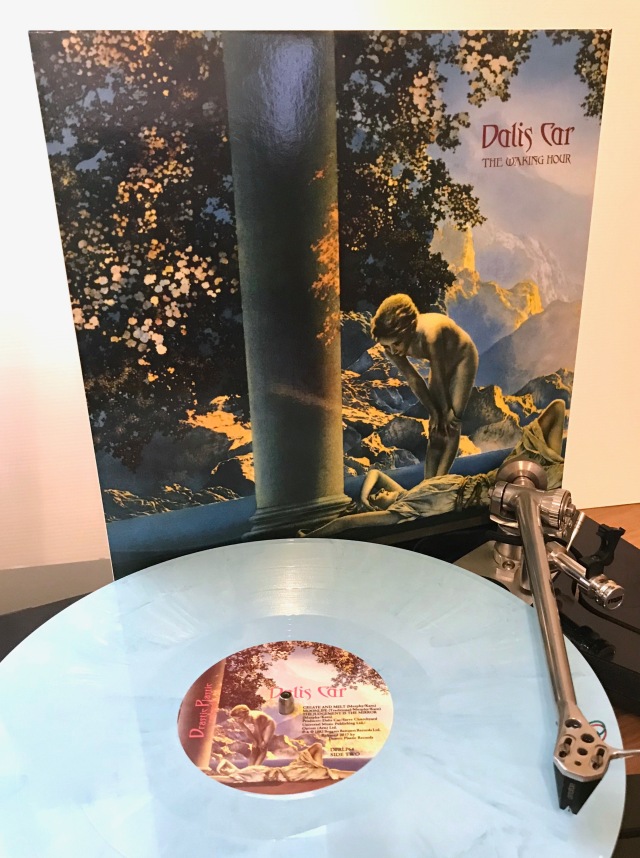
Given the cover art provided the impetus for this post, we must ask how the album cover matches the music. Compared to the original Maxfield Parrish painting, full of romantic softness and autumnal richness, not very well. But Dali’s Car did not reproduce the famous poster exactly. Here it is given a distinctly blue tinge, the warmth being leeched by an altogether chillier dawn. To these eyes and ears, that fits the measured, slightly alienated synthesizer tones rather well.
In the next post, we’ll listen to the other albums and muse about Daybreak as a muse.

Dali’s Car — The Waking Hour [Paradox Records 1984 / Drastic Plastic Records 2017]
Artwords by Augenblick / Musicwords by Vinyl Connection
This is Art On Your Sleeve #4

I remember being quite pissed off at how short the album was. I never owned the attractive blue vinyl, having transitioned to CD well and truly at that stage. I like the record, and I still play it from time to time.
LikeLiked by 1 person
Likewise. It’s playing now; sufficient variety and invention to reward repeated spins. And as we’re both saying, it doesn’t exactly wear out its welcome!
LikeLiked by 1 person
I have to say that what I like best about the album is the blue vinyl itself! I sampled each cut via YouTube and am not a fan of the synth sounds. I agree completely with your assessment of how the the music does (album cover) and doesn’t (original art) match the images. Looking forward to your post on the other two albums.
LikeLiked by 1 person
The two participants in the Dali’s Car project (Mick Karn and Peter Murphy) both came from bands noted for their mannered, almost theatrical style (Japan the former, Bauhaus the latter). It is certainly ‘of its time’ and I can quite understand a cool reception!
LikeLiked by 1 person
I really like the art. Very striking… though I can’t say I’ve ever spotted any of the albums that use it.
Beautiful LP, too!
LikeLiked by 1 person
When I read about the coloured vinyl re-issue, well after the first collaborative draft was written, I put the exercise on hold until I could track down a copy. Drastic Plastic Records did a really fine job, eh?
LikeLiked by 1 person
Aye, that they did. Perfect timing, too!
LikeLiked by 1 person
I really enjoyed this post. Here’s a weird thing. I’ve never heard of Parrish and I’ve never seen this painting before. I like to think of myself as a fairly educated person with a wide range of interests and knowledge, but this has completely passed me by. Thanks for the education.
LikeLiked by 2 people
That’s great Jeff. I’m delighted you enjoyed it and learned something too! Although JDB and I don’t collaborate often, I really value doing something different in blogging and her appreciation of art and culture add hugely to the Art On Your Sleeve posts.
LikeLiked by 2 people
Cracking post – being from across the Pond, I’d never heard of the artist, but it’s certainly an arresting image. I might use it myself on an album!
LikeLiked by 2 people
Why not? Perhaps the artists featured in the concluding part of this post will provide further inspiration in their variations on the Parrish theme.
Glad you enjoyed it Andrew.
Bruce
LikeLiked by 1 person
My parents had a reproduction of “Daybreak” hanging in the upstairs hallway of their house when I was a kid.
LikeLiked by 1 person
Good. One of the 200,000 accounted for!
LikeLiked by 1 person
That’s a nice theme. I like Japan just fine and Bauhaus quite a bit, but this record never grabbed me. You have amazing focus and discipline, I think. Huge fan of the Parrish hues. Very inspiring, and often remind me of rose wine.
LikeLiked by 1 person
Yes! Rose! Much maligned, but currently enjoying a renaissance of sorts. Maybe ‘Daybreak’ will too. Prost.
LikeLiked by 1 person
[…] a recent post, blog friend JDB of Augenblick introduced the famous Maxfield Parrish painting ‘Daybreak’ and […]
LikeLike
Wowzers, more on this excellent work! Love the painting. Love the history. And now I wanna hear the album!
LikeLiked by 1 person
Well, A, if you like either Bauhaus or Japan, you’ll probably enjoy Dali’s Car – it is very much ‘of its time’ but has an 80s electronica charm, I reckon.
LikeLike
In the right mood, on the right day, sure! 🙂
LikeLiked by 1 person
Yep, both are a bit like that!
LikeLike