A collection of album covers featuring vinyl records.
*
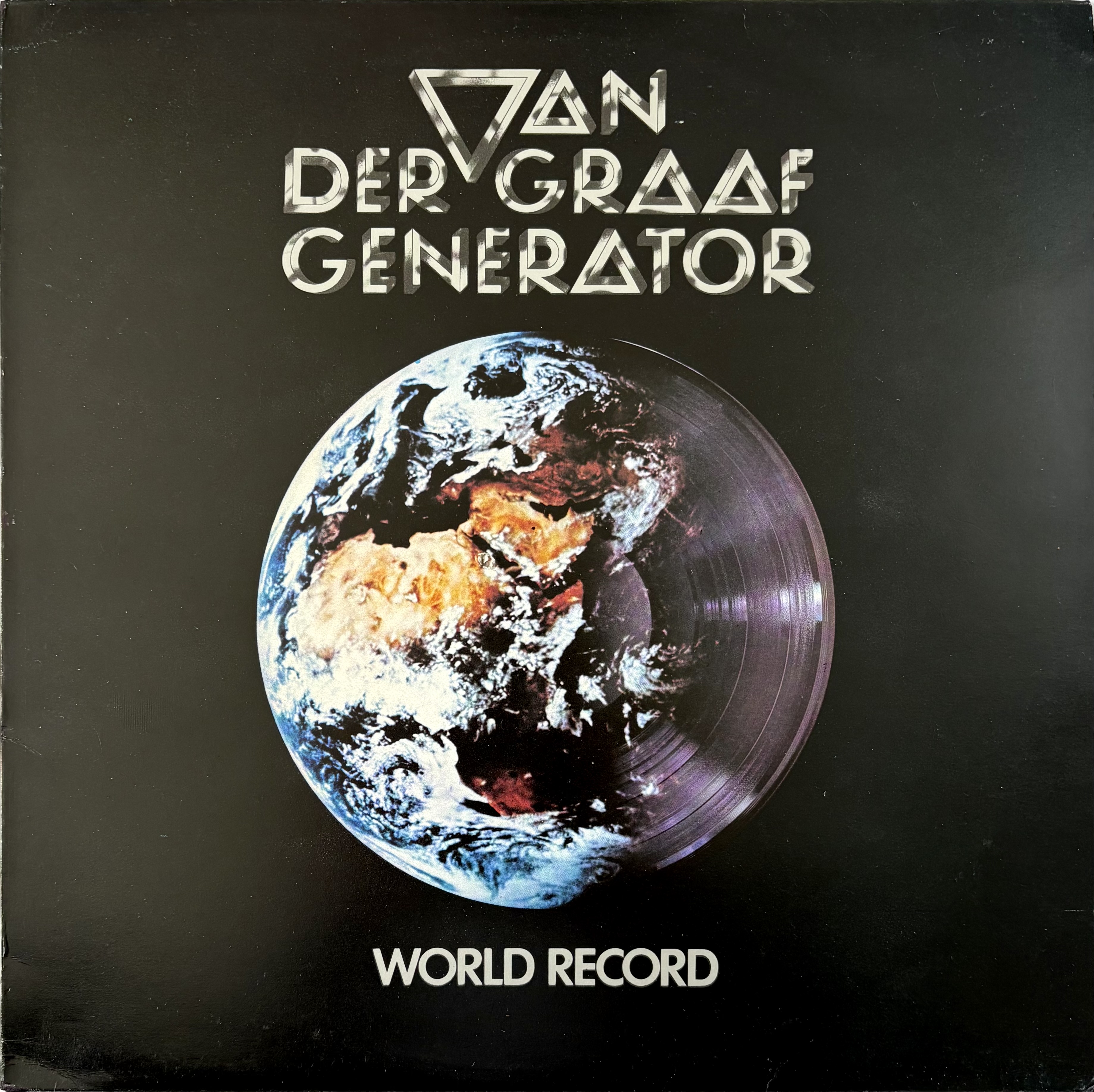
Let’s start globally, shall we? Van Der Graaf have it large with a record the size of the earth.
VAN DER GRAAF GENERATOR — World Record [1976]
*
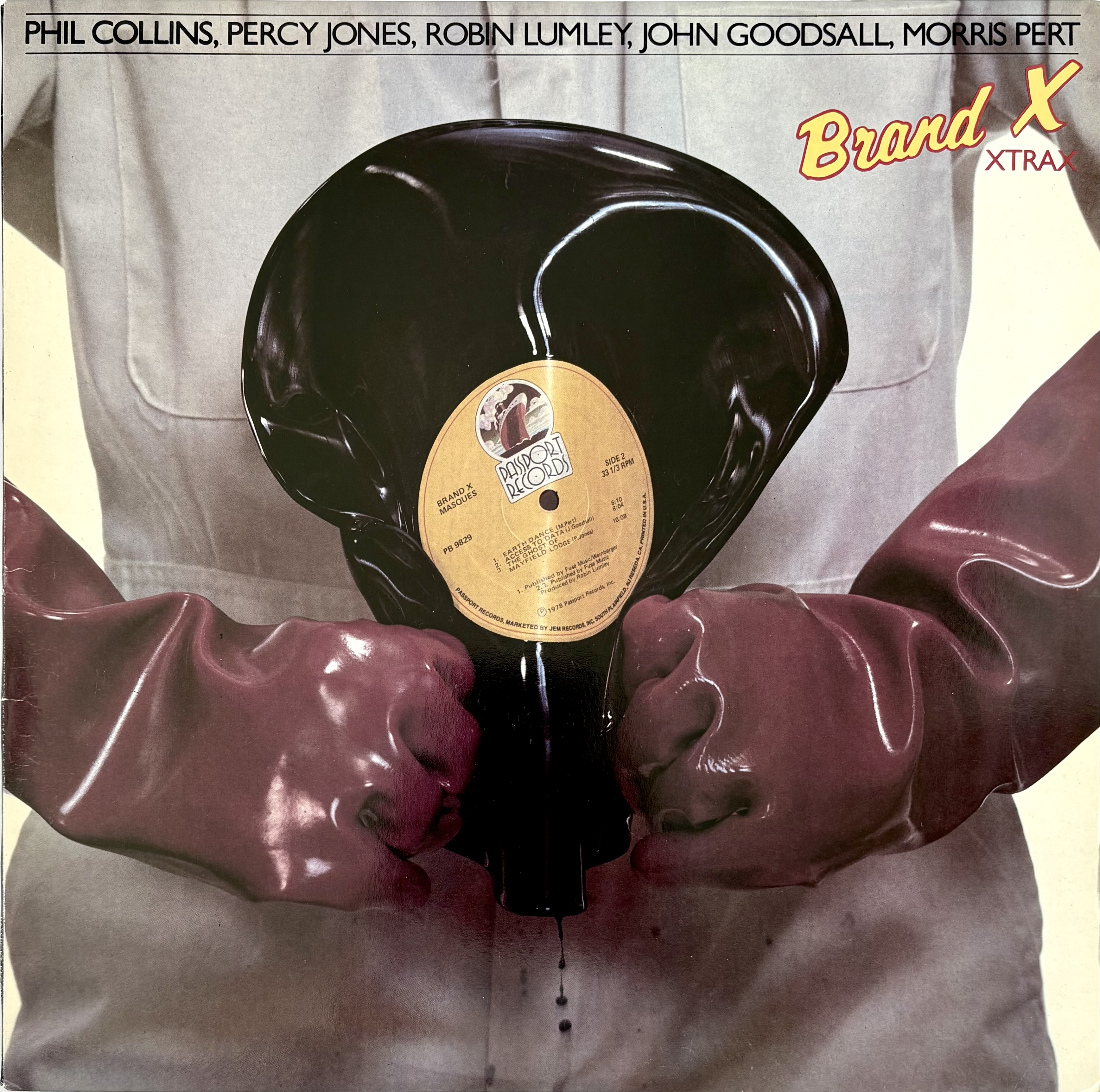
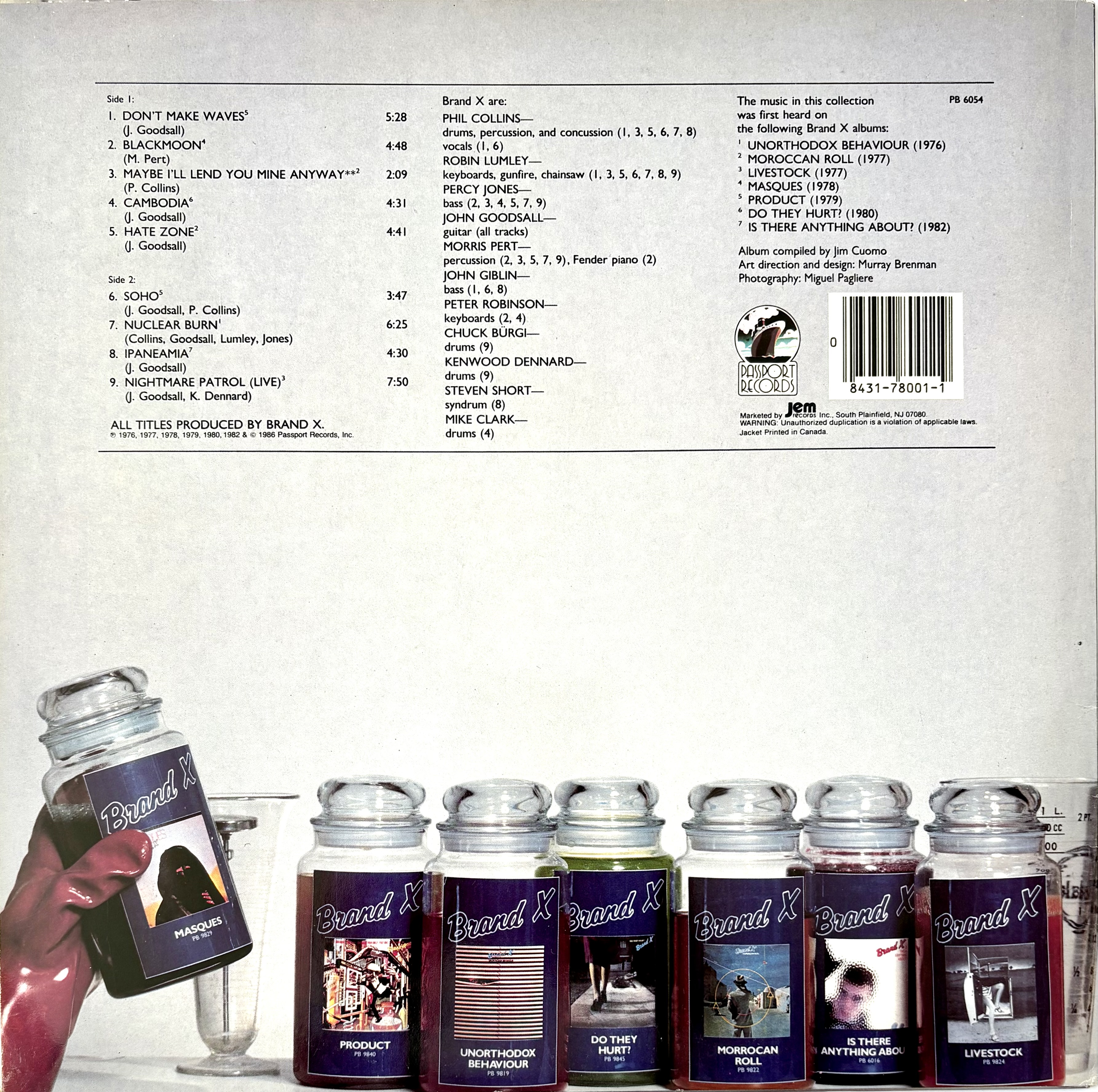
Despite it being a record obsessive’s nightmare, I do love this cover (which is not by Hipgnosis). The image of music being squeezed from PVC (an oil product) is delicious, if environmentally dodgy. And on the back cover we have the products arising from this extraction process.
Art direction and design by Murray Brenman.
BRAND X — Xtrax [1979]
*
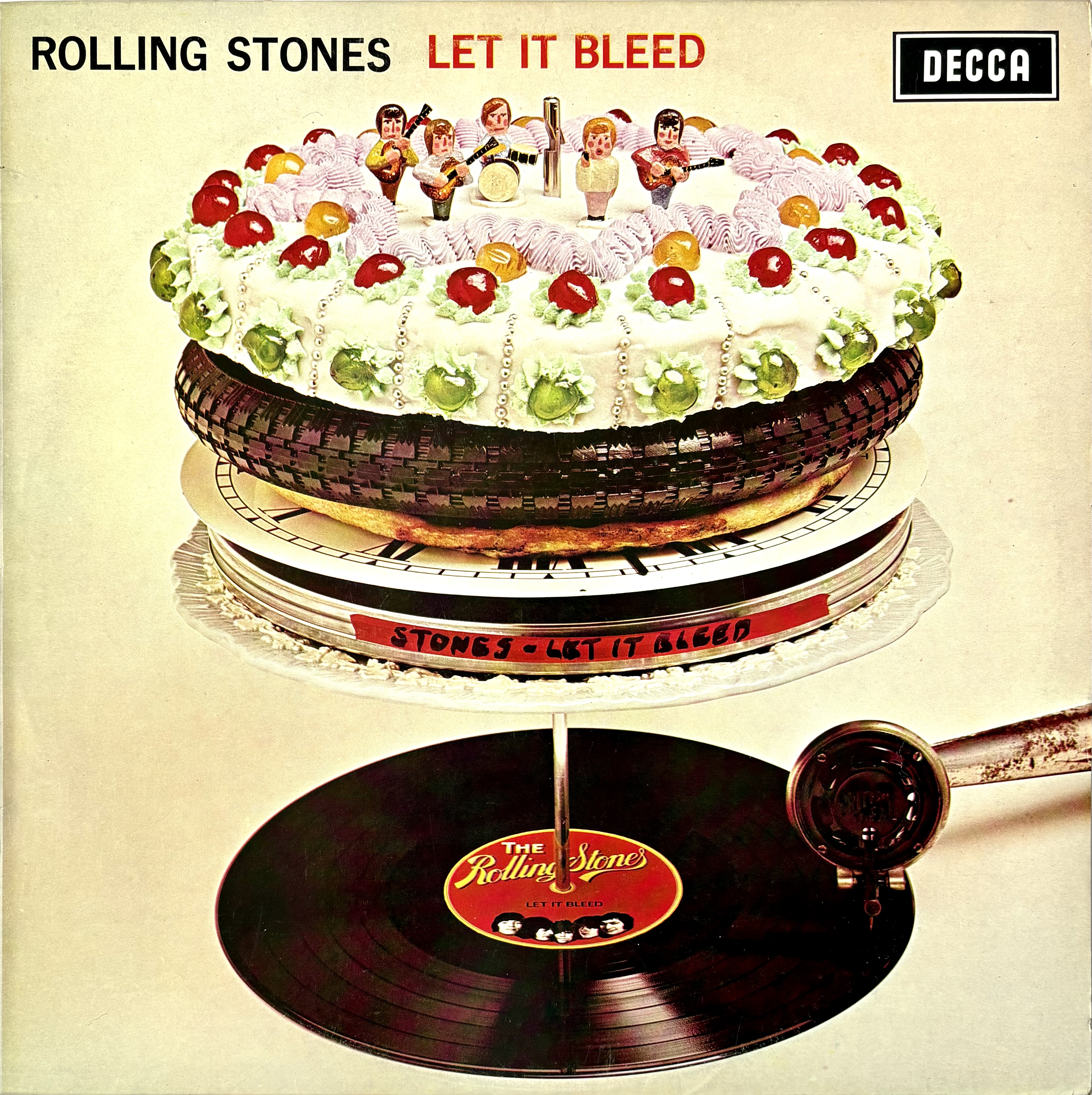
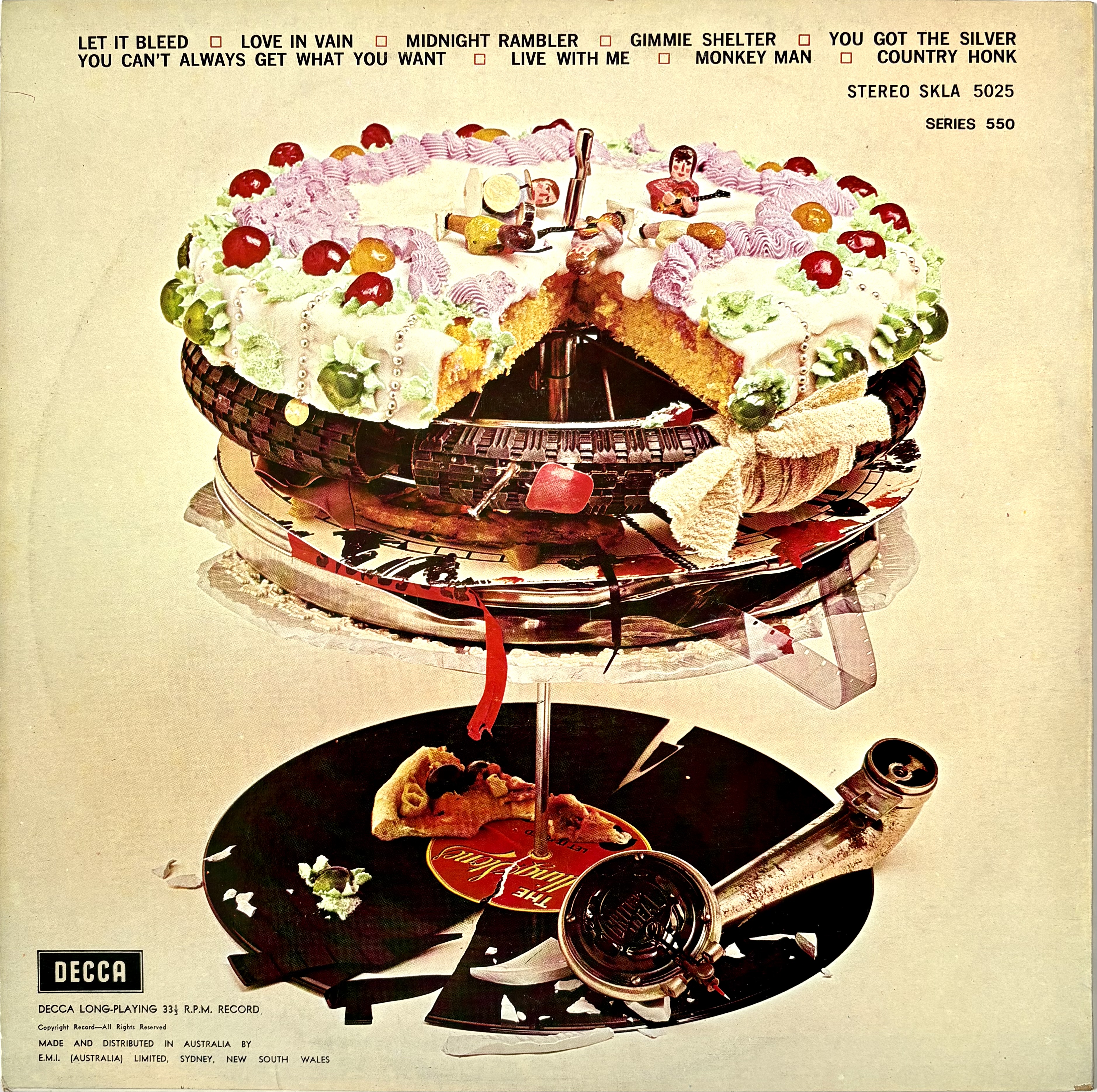
An iconic album cover with the classic double hit of a story that continues on the back cover.
ROLLING STONES — Let it Bleed [1969]
*
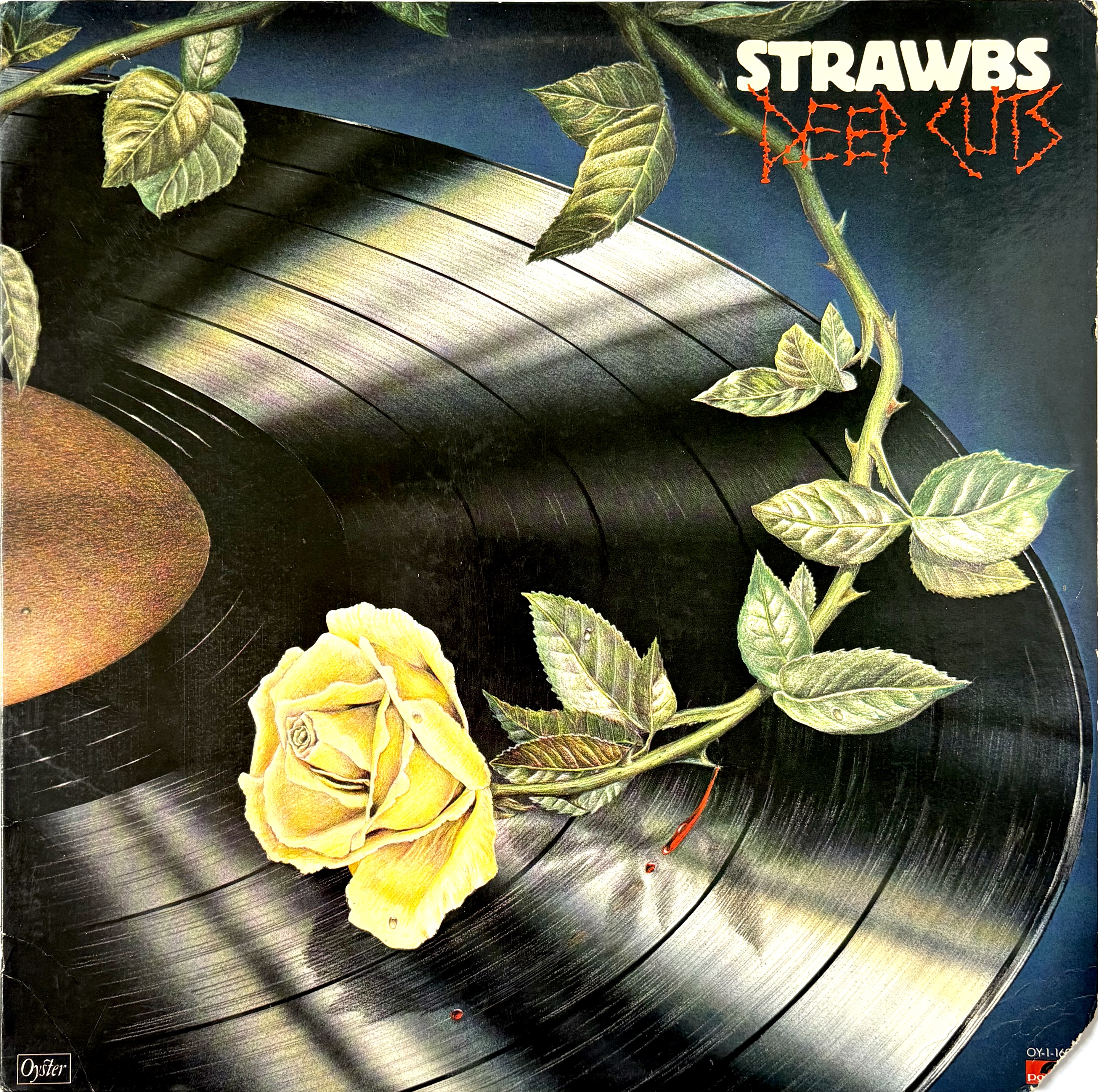
There’s a darkness to this artwork that does not really reflect the music. It could be a posthumous collection of rarities, but is in fact a lacklustre late career studio LP.
STRAWBS — Deep Cuts [1976]
*
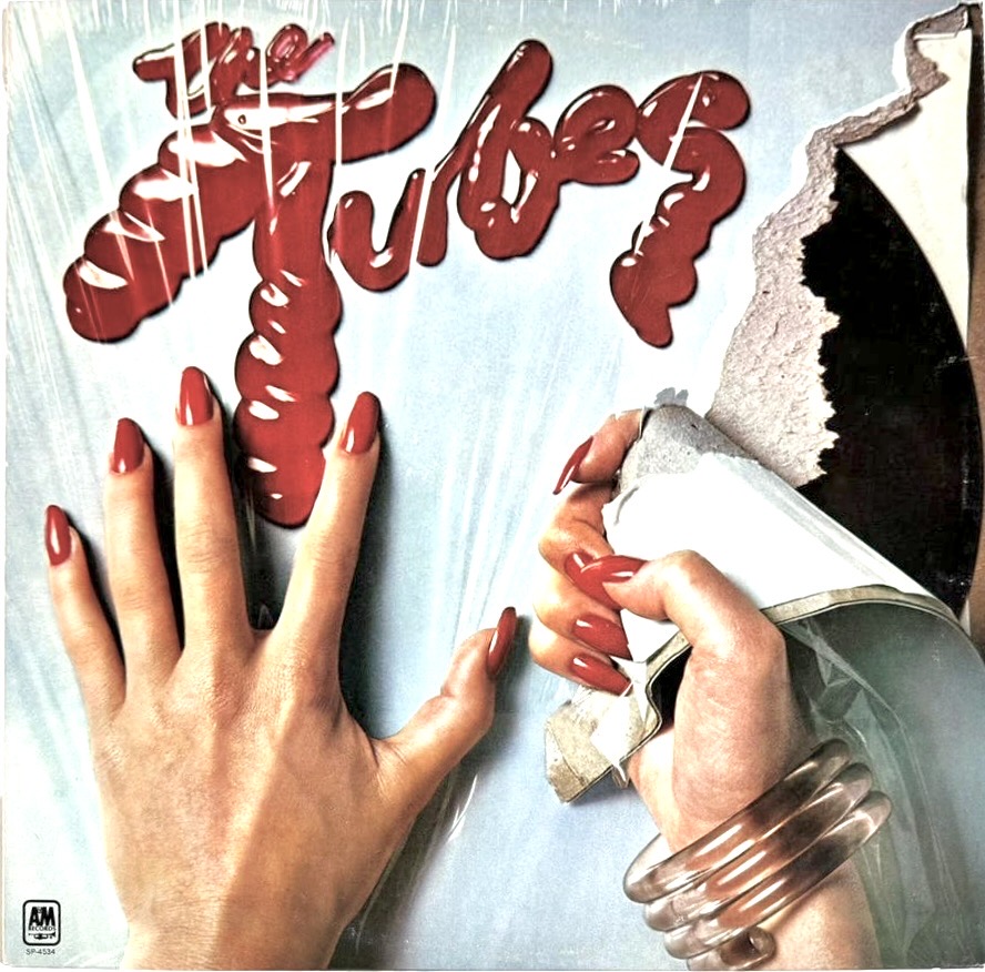
The Tubes debut has one of my all time favourite record sleeves. Several covers here attack the vinyl record—the Stones and Brand X, for example—but here we have the cover being torn apart. What is the back story here? You desperately want to know what led to such wanton destruction. What’s more, it is so well photographed that it looks three dimensional. Brilliant.
Photography by Harry Mittman, art direction by Roland Young.
THE TUBES — The Tubes [1975]
*
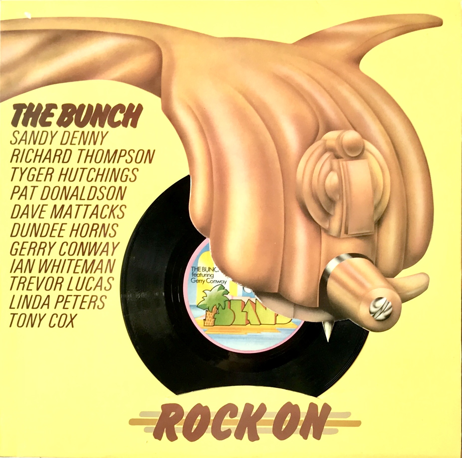
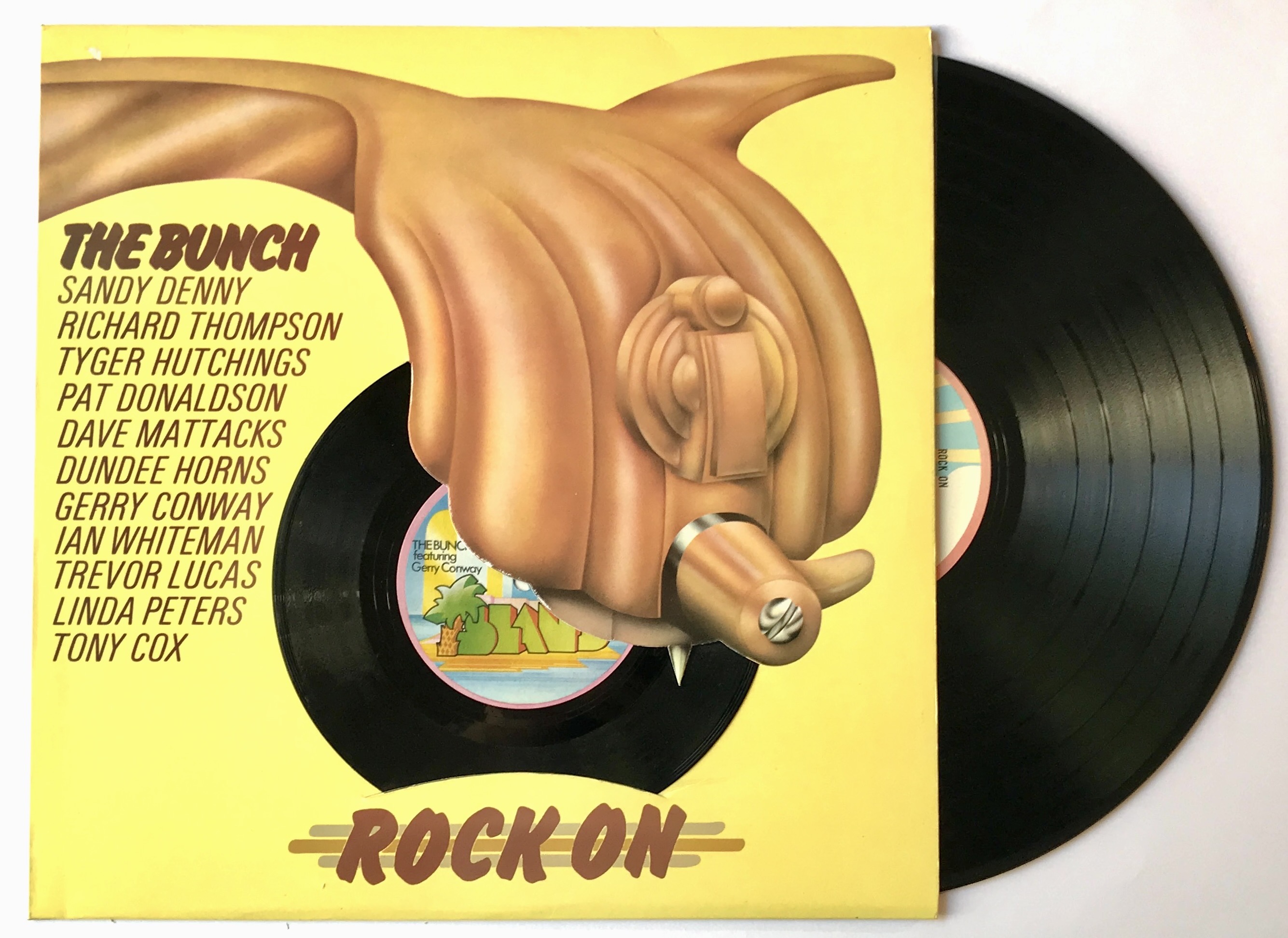
This fascinating vinyl artefact has popped up a few times at Vinyl Connection. A couple of things make it special. Firstly, the business end of the antique tone arm is die cut, with the stylus being pointy cardboard. Secondly, the 7″ is a real flexidisc that can be played (though not often; they degraded very quickly).
Design: Eckford / Stimpson.
THE BUNCH — Rock On [1972]
*
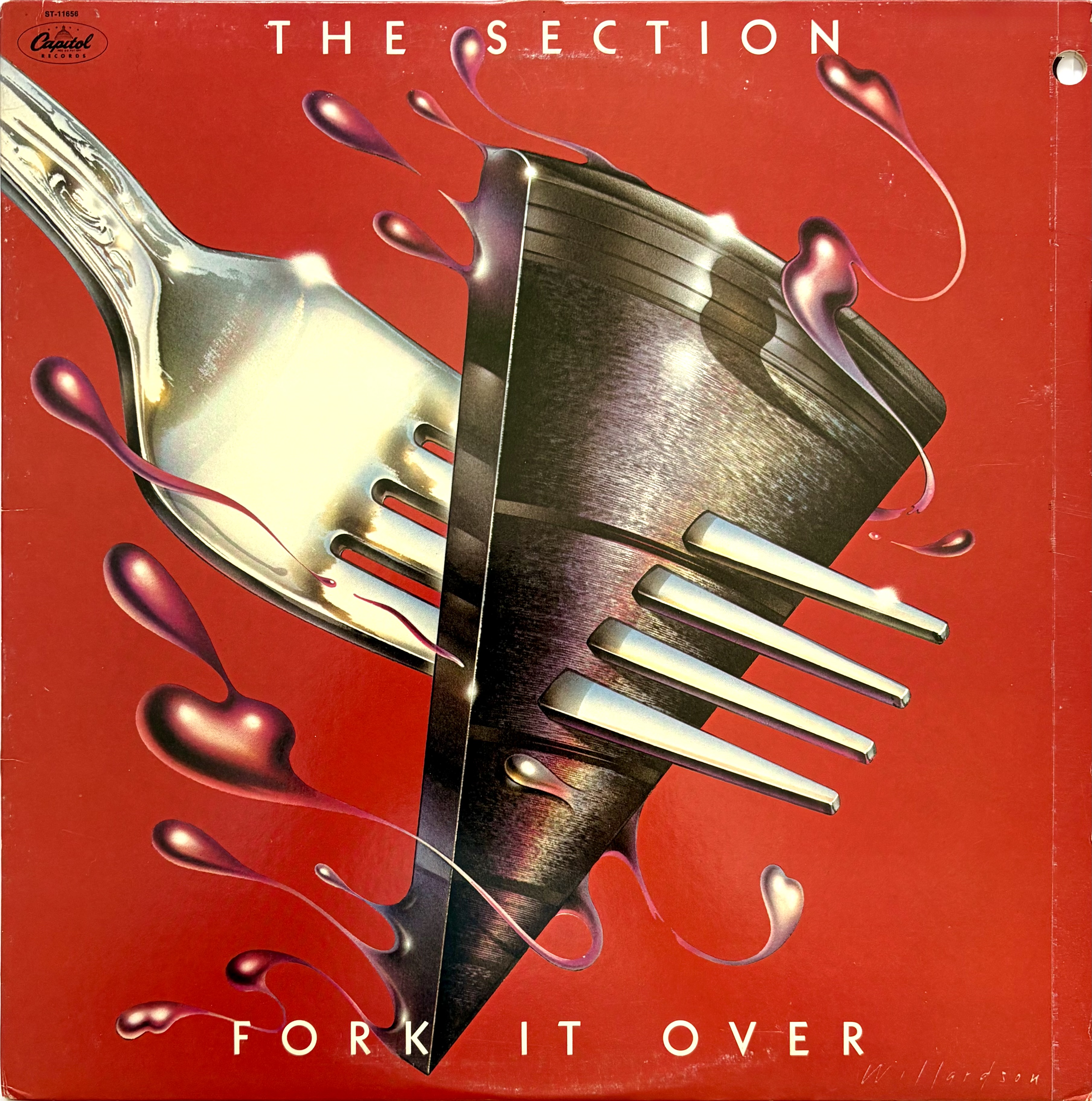
A scratch band of West Coast in-demand session players—Danny Kortchmar (g), Russ Kunkel (d), Leland Sklar (b) and Craig Doerge (k)—The Section made three albums in the 70s. This LP is a nicely played instrumental set that has elements of The Crusaders and Steely Dan. Not a particularly memorable cover but another inclusion for the vinyl abuse list.
THE SECTION — Fork it Over [1977]
*
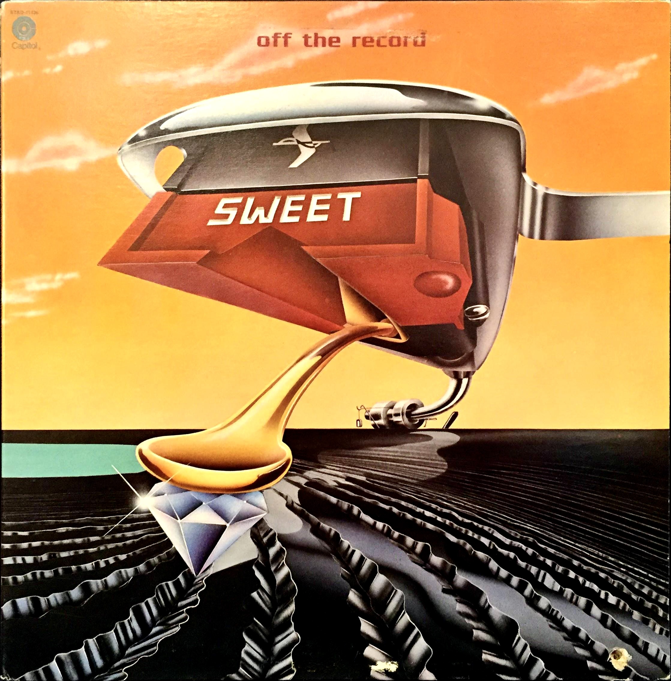
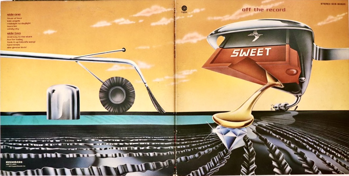
Not just an interesting design, but a lesson in how analogue records work. Love the inclusion of one of those popular (and ineffective) tone-arm style record cleaners on the back cover. I think mine is in a box in the garage.
Get in the groove, man.
Sleeve concept and design: Norman Goodman.
SWEET — Off the Record [1977]
*
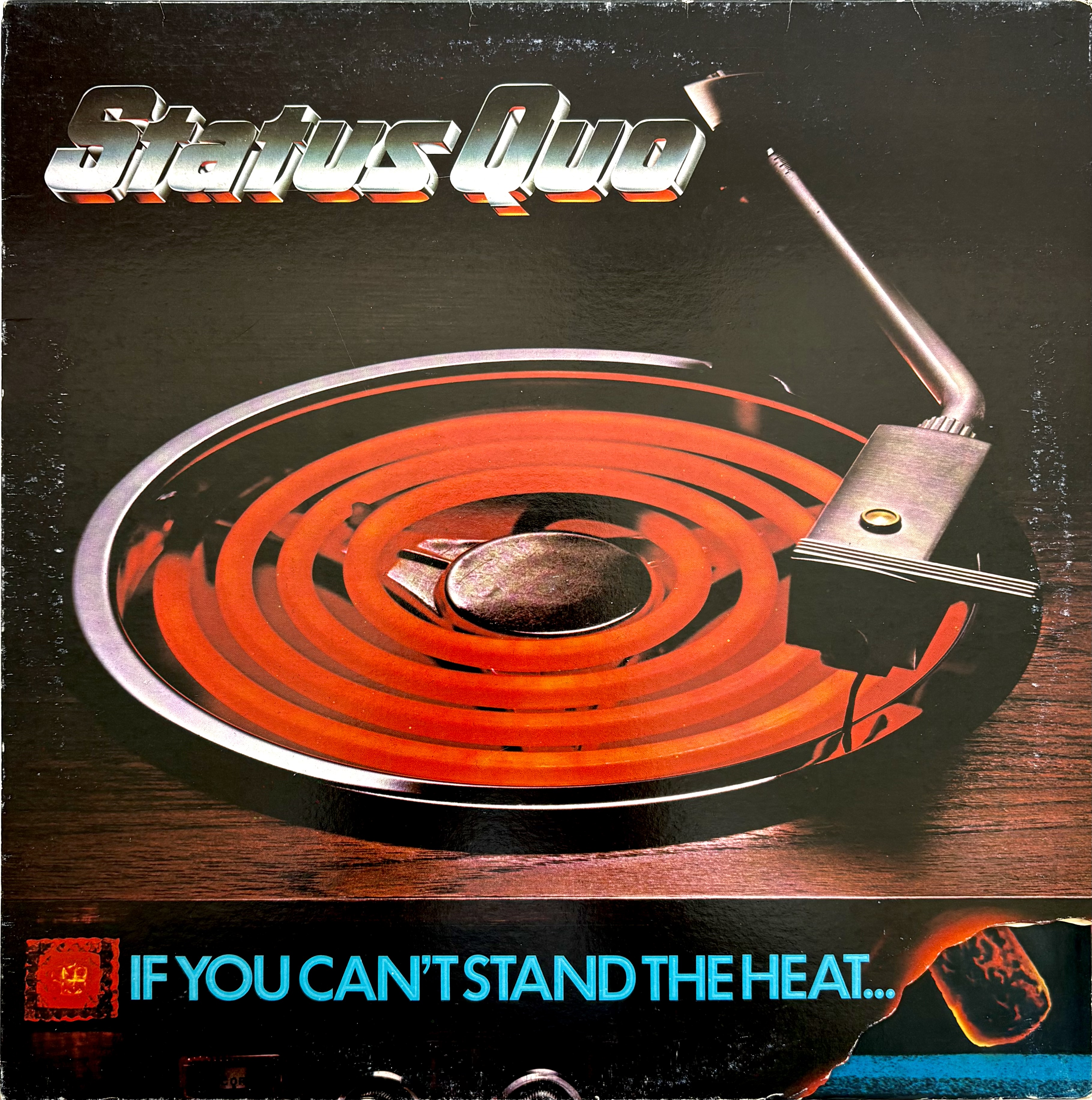
Feature Image
Strictly speaking, it isn’t a vinyl record that tone arm is reaching for, it’s an electric cooker. What’s more, the gatefold opens up to reveal a very large matchbook. It’s all about the heat, I guess.
STATUS QUO — If You Can’t Stand The Heat (1978)
*
Favourites here? (Either musically or the art work.)
Others that would fit right in?

Strawbs a poor man’s Yes? Answered that question in the affirmative. Apologies for the lack of gender inclusion but based on Genesis’s early demographic I guess I would have fitted in there squarely. Remember purchasing this in the record shop main street Lilydale. Which still retained something of its country town origins still (mid-seventies). Probably rightly critically unacclaimed on release. Hard Hard Winter, Simple Vision and Beside the Rio Grande may have resonated at the time. IMHO Grave New World tops followed by Bursting at the Seams were peak Strawbs. I met Dave Cousins years later in the UK. Members of the original band were doing a re-union tour of mostly obscure country venues. I was channeling Bazza McKenzie (I’d had a few pints). So I think Dave thought I was from Mars. John Ford who co-wrote the Strawbs greatest hit the atypical ‘Part of the Union’ with Richard Hudson. Was a much more relaxed friendly bloke. I can vividly remember purchasing Deep Cuts. The cover promised so much. It had been a hard hard winter so I may have felt ambivalent when I got home and played it. Besides Graham Parker was just around the corner Prog-Rock was going the way of the dinosaurs.
LikeLiked by 2 people
Thanks for this wonderful stream of consciousness reverie, Woody. ‘From the Witchwood’ is interesting, isn’t it? But I never made it to Strawbs fandom nor felt the prog connection (excepting Hero & Heroine and Mr Wakeman’s early contributions) … nor did I ever meet a member of the band. Great story.
I’d buy you a beer or two to discuss the so-called demise of prog. In 1976 it may have peaked in terms of invention but was still in flying high and massively popular. My vote for a poor person’s Yes would go to Starcastle, btw. 😉
LikeLike
Actually Deep Cuts sold well but the band by then were transitioning to gaining a foothold in the American market. With compromise the music making may have suffered. ‘Ghosts’ was another album that had that ‘gothic’ sensibility, ultimately may have appealed more in the UK than in the USA. Maybe I’ll take you up on that offer of a beer or two Bruce. I do get down your way occasionally!
LikeLiked by 1 person
Interesting theme for a post. Sadly, I only know one album: “Let It Bleed,” by The Rolling Stones. At least it’s a mighty fine one, which falls into what arguably was the Stones’ peak period! 🙂
LikeLiked by 1 person
Certainly part of the peak Stones run, Christian. 👍
Yes, this is primarily an album cover art post that reveals, perhaps embarrassingly, how a significant number of VC purchases have been driven by what is on the cover of the LP!
LikeLiked by 1 person
Let it Bleed’s after the party dénouement picture suits a sing-a-long swag of songs.
The Sweet album art is neat.
LikeLiked by 1 person
That red hot stove burner is pretty eye catching, a good sales pitch and great use of range. But the playable flexidisc is cool, I ran across some of those things tucked in the backs of old National Geographic magazines, what a fun little present. Nice collection of covers!
LikeLiked by 1 person
Nice. You may have already posted this one in another edition of this theme, but… how about Alan O’Day’s 1977 LP Appetizers. On the cover he is serving a stack of 45s a la pancakes. I owned this album back in the day.
I did find a blog post that pictures the album cover:
https://theanalogkidblog.com/2016/01/13/lost-in-the-flood-hard-to-find-70s-albums-alan-odays-appetizers/
LikeLike
It probably doesn’t qualify, due to the image being only on the back cover, but that side of Jethro Tull’s “Songs From the Wood” has one of my fave images of a record (of sorts), and it’s a perfect evocation of what the album contains. (Kind of the organic opposite of the Brand X record). And I also always liked the cover of Roxy Music’s first “Greatest Hits” album from 1977, the aspirational gold disc (imprinted with the actual song titles) showing the A-side on the front, the B-side on the back, atop the sorts of peacock feather crossed with leopard skin fabric pattern that evoked Eno’s garb and the great Paul Thompson’s caveman costume, with the obligatory fashion goddesses admiring their own reflections in the disc’s surfaces.
LikeLiked by 1 person
Fun topic, Bruce!
LikeLiked by 1 person
Thanks Geoff! I think there’ll be a sequel.
LikeLiked by 1 person
I missed the Brand X but did grab a few of these because I was a white punk on dope.
LikeLiked by 2 people